Having a personal brand is very important - it speaks to your identity and allows someone to get a sense of your style and personality. My personal brand is constantly evolving, just like me. I’m an avid believer in less is more and wanted to evoke that through my brand. I also want my work to speak for itself so I never want my branding to be too bold or overwhelming. Although there are so many aspects of design and you can use design for so many things I like to ‘Design to Inspire’ - I want to tell a story, evoking emotion and action.
Buk’s Body Bar, a skincare line, was in need of a logo and simple branding. I developed a clean and minimal logo that emphasizes the alliteration of B’s. The B takes the forefront while the lines to the left imply the other 2 B’s. I wanted the logo to be able to stand alone but also complement the word mark. I utilized a thin typeface and a soft color palette to express a feminine and delicate style.
During my time at Atkin Olshin Schade Architects I was responsible for designing all marketing collateral and promotions. This included many Request For Proposals (RFPs) showcasing the methodology, work samples, fees, team resumes, etc. to best represent the company. I also worked on an overall company portfolio that laid out the vast amount of projects the company had worked on over the years. The principals wanted to update the brand and move towards a shortened name of AOS Architects. With this change, I was able to be heavily involved in the update of their website working with a Philadelphia Web Design company. This update also gave me the opportunity to update their brand and create a new logo.
AOS Portfolio Booklet © Atkin Olshin Schade Architects
AOS Portfolio Booklet © Atkin Olshin Schade Architects
AOS Portfolio Booklet © Atkin Olshin Schade Architects
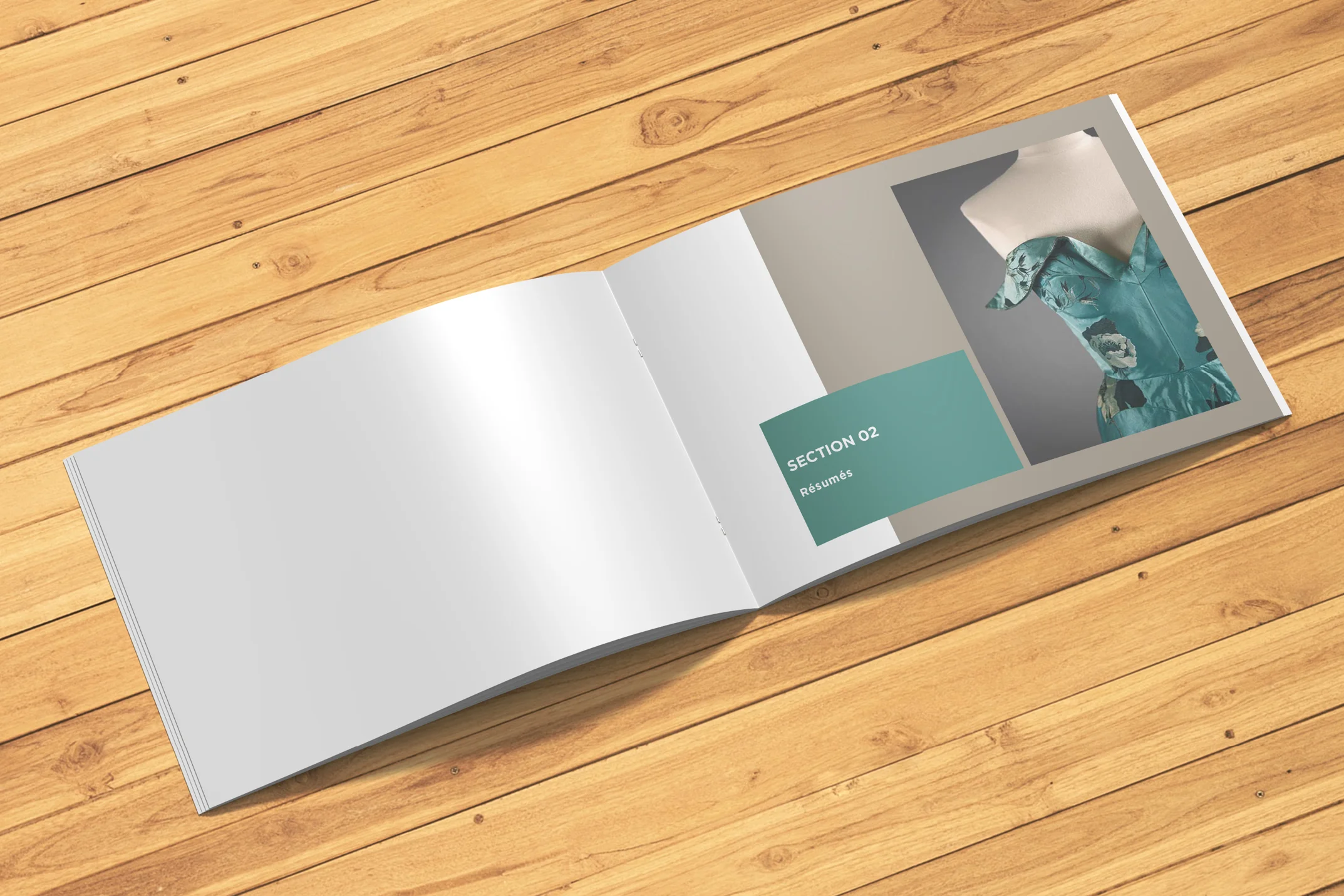
AOS RFP Booklet © Atkin Olshin Schade Architects
AOS RFP Booklet © Atkin Olshin Schade Architects
AOS RFP Booklet © Atkin Olshin Schade Architects
Being a freelance designer I’ve gotten to work with many different clients to meet their graphic design needs. Many of which include logo development and creation. Here is a collection of some of my favorite logos.
Here at Phenom People, as the Creative Team Lead on the Marketing Team my day to day responsibilities are diverse and ever changing. My ultimate goal is to support the company and the rest of the marketing team by designing marketing and promotional collateral to support their needs. This includes case studies, email templates, hero graphics, social imagery, logos and wordmarks, brochures and flyers, and eBooks. I also delegate design tasks, manage deadlines and provide feedback to the Creative Team.
Product Flyer © Phenom People
Full Page Advertisement © Phenom People, Inc.
Product Flyer © Phenom People, Inc.
Product Flyer © Phenom People, Inc.
See the full eBook. © Phenom People, Inc.
See the full eBook. © Phenom People, Inc.
See the full eBook. © Phenom People, Inc.
Year in Review Logo © Phenom People, Inc.
Lunch & Learn Logo © Phenom People, Inc.
PhenomTX Logo © Phenom People, Inc.
Phenom Pulse Newsletter Logo © Phenom People, Inc.
IAMPHENOM was a 2 day event hosted by Phenom People that brought together the brightest and most innovative minds in human resources and technology. The Marketing Team was tasked with planning and organizing this conference. Together, the Creative Team collaborated on branding, imagery, signage, and videos. The in person conference spawned the idea for a virtual conference and IAMPHENOM The Virtual Experience, or IAMPHENOM VX, was born. The Creative Team tweaked the branding, designed a new website, and created promotional materials.
STARK was a branding project during my senior year at The University of the Arts. This project has stayed with me over the years, as it sparked my love for branding and logo development. We were tasked with creating a faux television network, developing the overall brand for the company, from wordmark to advertisements to stationery to video transitions. STARK is a premium movie channel that showcases feature films from the film noir era, as well as modern adaptations. The brand plays off the stark contrast of darks and lights that were prominent in films such as The Big Sleep, The Maltese Falcon, and many more.
Being a huge fan of Audrey Hepburn, I jumped at the chance to showcase her as an iconic figure in this large scale typography project. Three different facets of her life and career were represented in this experimental poster series with found and manipulated imagery.
During my time at The University of the Arts, my closest friends and roommates were dancers. I always hoped for the chance to collide their world with mine. I finally got the opportunity with this music video project. We had complete freedom to piece together imagery, video, typography and music to produce a compelling video. This haunting, yet beautiful instrumental piece was paired together with dance improv. Video clips were superimposed resulting in a unique production.
Something to Believe In was my senior thesis at The University of Arts. During one of our many class brainstorming sessions my interest in sports sparked the comparison of sports and religion and the idea of my thesis was born. Over the course of the year, the project took many different directions, but I finally landed on 5 key principles that are at the root of both sports fans and religion; faith, prayer, hope, belief and worship. With that I searched for many sermons that spoke of these principles and paired them with images and videos from sports games, creating a strong correlation between sports and religion.
Typography was the focus of this editorial. Given the typeface Baskerville and an excerpt from Alexander S. Lawson’s Anatomy of a Typeface, I illustrated his words and the many characteristics of Baskerville.
Often friends and family, and sometimes freelance clients, ask me to design invitations and chalkboard signs for special occasions. I enjoy being able to lend my creative services to friends and family and give their event a special, handmade touch.